Enabling employees to create and discover internal communities
Whober is an internal platform used at Uber to connect employees through professional communities, knowledge sharing, and interest-based groups.
The goal of the platform is to strengthen collaboration across teams and regions by enabling employees to create, join, and manage communities around topics such as design, engineering, diversity groups, and professional development.
Company
The research revealed three major problems.
Product
Whober
My Role
Senior Product Designer
Date
Improve the experience of discovering, creating, and managing internal communities.
Scope
Improve the experience of discovering, creating, and managing internal communities.

Context
Uber operates globally with thousands of employees distributed across teams and time zones.
Although many internal communities existed, employees struggled to:
Discover relevant groups
Understand different community types
Create new groups without engineering support
This fragmented knowledge sharing across the company.
Whober was created as a centralized platform where employees could create and participate in internal communities.
However, the experience had major usability challenges..
The Problem
Internal research revealed key friction points in the platform:
Confusion between different group types
Difficulty discovering relevant communities
Slow and complex group creation
Dependency on engineering to create groups
These barriers reduced engagement and slowed the growth of internal communities.
My Role
As Product Designer, I:
Led UX research
Identified key user pain points
Designed new discovery and group creation flows
Prototyped and validated solutions with users
Collaborated with PMs and engineers on the final solution
The redesign followed Uber’s internal design system.
Research
To understand the challenges, I conducted:
User interviews with employees across teams
Surveys to capture usage patterns
Usability analysis of the existing platform
The research revealed the main barriers preventing employees from engaging with internal communities.
The research revealed three major problems.
Confusing group structures
78%
of employees reported confusion when trying to understand the difference between group types and categories.
Users struggled to determine:
• What type of group they should create
• How existing groups were organized
Poor discoverability
92%
of employees had difficulty discovering relevant communities.
Even when communities existed, users often didn’t know they were available.
This limited participation and engagement.
Complex group creation
71%
of employees reported that the process of creating a group was too slow and complicated.
Creating a new community often required:
Manual processes
Internal requests
Engineering involvement
This created a major barrier to participation.
Benchmark Analysis
In addition to user research, I analyzed existing platforms that successfully support community building to understand common patterns and best practices.
To better understand how successful platforms structure and manage communities, I analyzed three widely used tools: Workplace from Facebook, Facebook Groups, and LinkedIn Groups.
The goal was to identify patterns that improve community discovery, organization, and participation.
Workplace from Facebook
What works well
Clear separation between communities and conversations
Structured navigation that helps users quickly access groups
Familiar social interaction patterns
Insight
Structured navigation makes it easier for users to locate communities and understand where discussions happen.
Facebook Groups
What works well
Strong discovery through recommendations and search
Clear group identity with cover images and descriptions
Easy onboarding when joining groups
Insight
Visual identity and clear descriptions help users quickly understand the purpose of a community before joining.
LinkedIn Groups
What works well
Professional context aligned with knowledge sharing
Topic-driven discussions
Communities organized around expertise
Insight
Professional communities benefit from clear topic structures that encourage meaningful discussions.
Design Strategy
Based on the research insights, we defined three key principles to guide the redesign.
1. Self-service creation
Employees should be able to create communities independently without needing engineering support.
2. Clear group structure
The platform should simplify how communities are categorized and presented.
This would help users quickly understand where they belong.
3. Improved discoverability
Communities should be easier to find through improved navigation, filtering, and visual structure.
Mapping the Experience
To better understand the current journey and identify opportunities for improvement, I created a User Story Mapping exercise with the team.
This helped visualize the entire flow:
discovering communities
evaluating them
joining them
creating new groups
Through this mapping we were able to identify key friction points and prioritize improvements.
Early Exploration
With the key problems defined, I began exploring multiple concepts for improving the experience.
Early sketches focused on:
simplifying the group creation flow
clarifying community types
improving how groups are presented and discovered
These explorations allowed us to quickly iterate on ideas before moving to higher fidelity prototypes.
Prototyping the Solution
Based on the early explorations, I created interactive prototypes that redesigned two critical areas of the platform:
Community discovery
Group creation flow
The new solution introduced:
clearer group categories
simplified onboarding for new groups
a structured creation process
improved browsing and filtering
This allowed employees to navigate and understand the platform more easily.
Usability Testing
To validate the proposed solution, I conducted usability tests with employees who had previously used the platform.
The goal was to evaluate whether the new design improved:
group discoverability
clarity of community types
ease of creating a new group
Participants were asked to perform key tasks such as:
finding relevant communities
joining groups
creating a new community
The results showed a significant improvement in usability and task completion speed.
Final Design
The final design introduced a more structured and intuitive experience for discovering and creating communities.
Key improvements included:
simplified group taxonomy
clearer navigation structure
streamlined group creation flow
improved visual hierarchy
These changes reduced friction and allowed employees to engage with the platform more naturally.
Impact
After implementation, the new experience significantly improved how employees interacted with the platform.
Key outcomes included:
employees could create communities independently without engineering support
faster group creation process
improved discovery of internal communities
increased participation across different teams
The redesign helped strengthen collaboration and knowledge sharing across Uber’s internal network.
Key Learnings
This project reinforced several important lessons about designing internal platforms.
Empower users through self-service
Reducing dependency on technical teams enables faster adoption and growth.
Clarity drives engagement
Users are more likely to participate when structures and categories are easy to understand.
Internal tools deserve great UX
Even internal products can have a significant impact on productivity and collaboration when designed thoughtfully.


User testing
For this phase of the project, I chose to carry out unmoderated tests, It was possible to identify 85% of the usability issues and also get a clear view of what was working and what was not, over each iteration cycle.


Interestingly, the most engaged areas were where users expected to access groups.
User Story Mapping
I also created a user story map to visualize the entire process from the user's point of view focusing on the key steps and actions needed to reach our main goal for the MVP. This helped align the team around what really mattered, creating a shared understanding of where to focus our efforts.


UI Design
With clear goals and insights in hand, I translated ideas into high-fidelity interfaces. The focus was on creating a clean, intuitive, and consistent experience aligned with the company’s design system — while making it easier for users to navigate, connect, and take action.

New layout organizes content in a centralized manner. The badges section now features employees' main achievements without relying on engineering.

In the dedicated groups section, a “Create Group” button is immediately visible and ready to be explored. Additionally, all groups that the user manages are visible, as well as a quick filter to help with quick searching.

On the group page, a tag shows what type of group it is, its visibility, contacts, members, features, and how many groups are linked to it.

The tag type "Whober group" is located just below the group name, as well as information about the number of members.


A session dedicated to informing about all the group's visibility
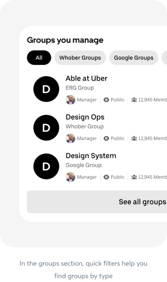
In the groups section, quick filters help you find groups by type

When inserting a profile image for the badge type group, the inserted image is automatically displayed in the personal profile.


Results
95% reduction in group creation time
With the new self-serve flow, users can create and manage groups in under 1 minute — a 95% reduction in time. That’s more time back for engineering to focus on high-impact work.
100% increase in user autonomy
By moving the entire group creation and joining flow into Whober, users now have full control, creating a smoother and more connected experience.
Streamlined onboarding
New employees can now find and join relevant groups directly within the platform, helping them integrate into the company culture from day one — solving the disconnect.
Improved consistency
The redesigned UI aligned with the official design system, reinforcing trust and usability across the platform, which was previously outdated and hard to navigate.
